A bold website still needs a clear next step.
How I balance a distinctive visual identity with readable content, responsive layouts, and useful interactions.
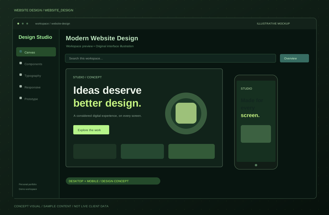
Decide what the visitor should understand
Before choosing animations or colors, I define the message. Who is the website for? What should the visitor learn? Which next step matters most? A clear answer helps the visual design support the content instead of competing with it.
Build a consistent visual language
Typography, spacing, contrast, borders, and image treatment create the character of a website. For a hacker-inspired interface, I use a restrained palette, terminal details, and technical visual cues. Consistency makes those elements feel intentional across the homepage, projects, articles, and contact section.
Make interactions earn their place
A project filter should help someone find relevant work. A detail view should add substance. Animation should create atmosphere without preventing reading or navigation. I include motion controls and consider keyboard access so the experience remains usable in different situations.
Review the small-screen journey
A desktop composition needs to adapt to the available space. I check whether headings remain readable, buttons are easy to reach, images retain their meaning, and fixed elements can be collapsed. The final review follows the visitor’s journey from introduction to contact.